


11
3M Scotch-Brite Scrub Sponges

9
3M Movers Campaign

0
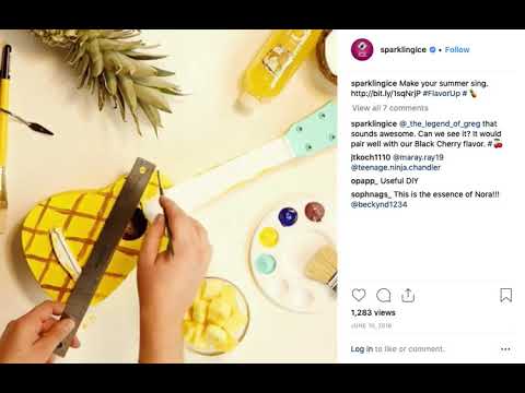
Cargill Deli—Social

11
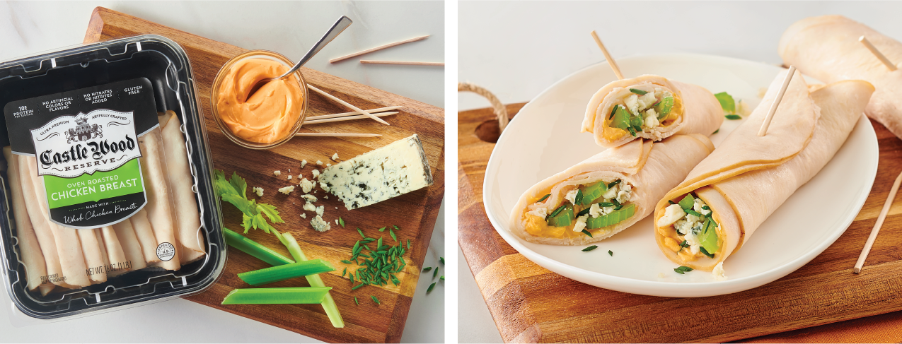
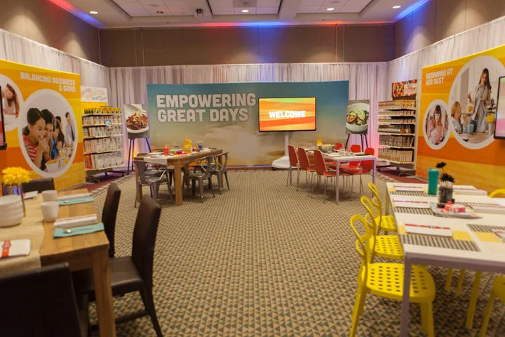
Cargill Deli—Photoshoot

14
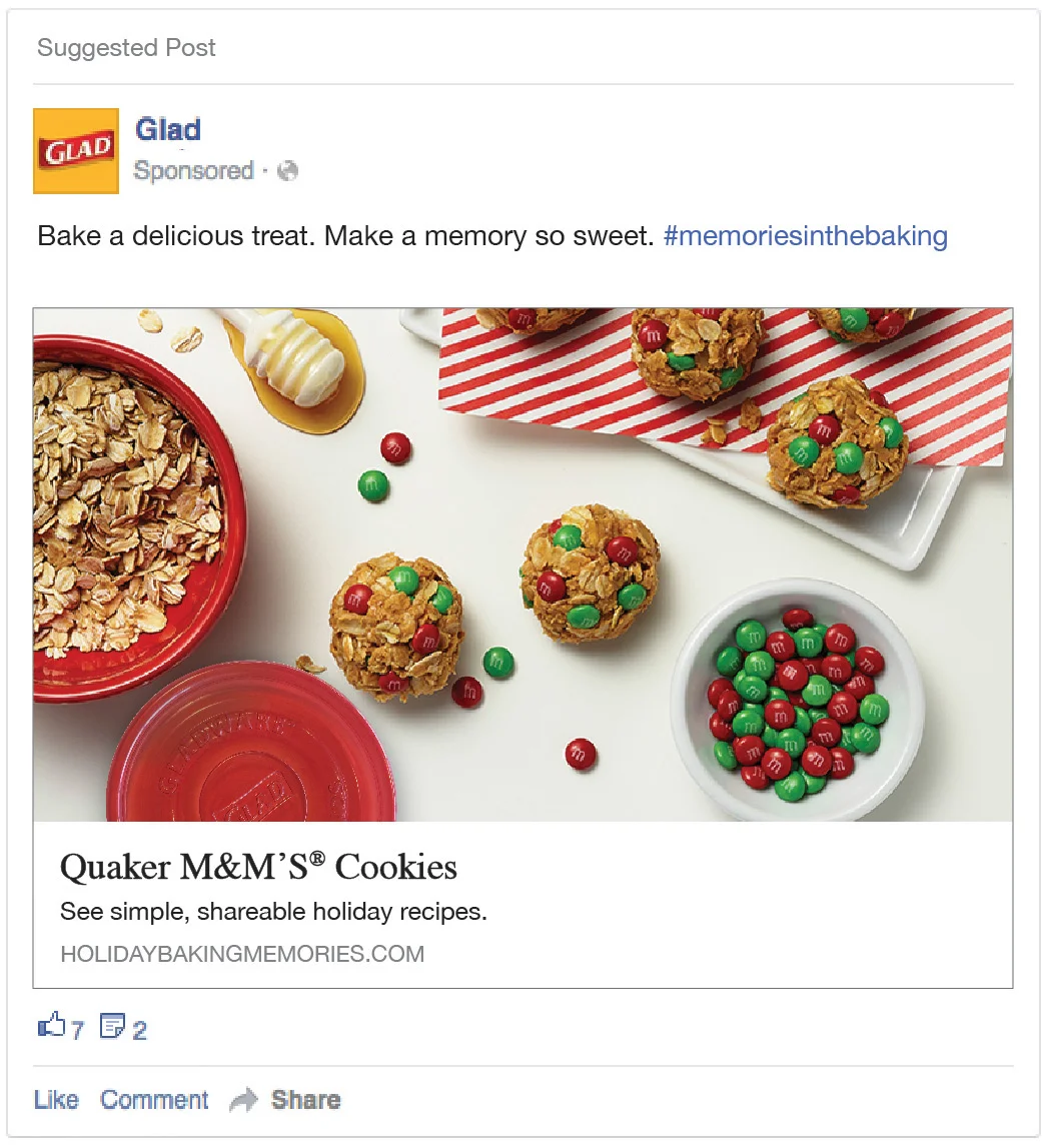
M&M's, Quaker, Glad Partnership

6
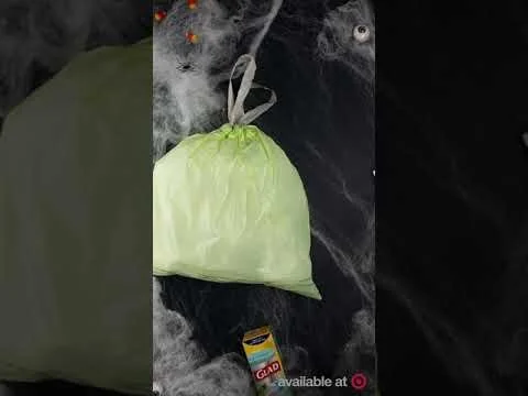
Glad Halloween

32
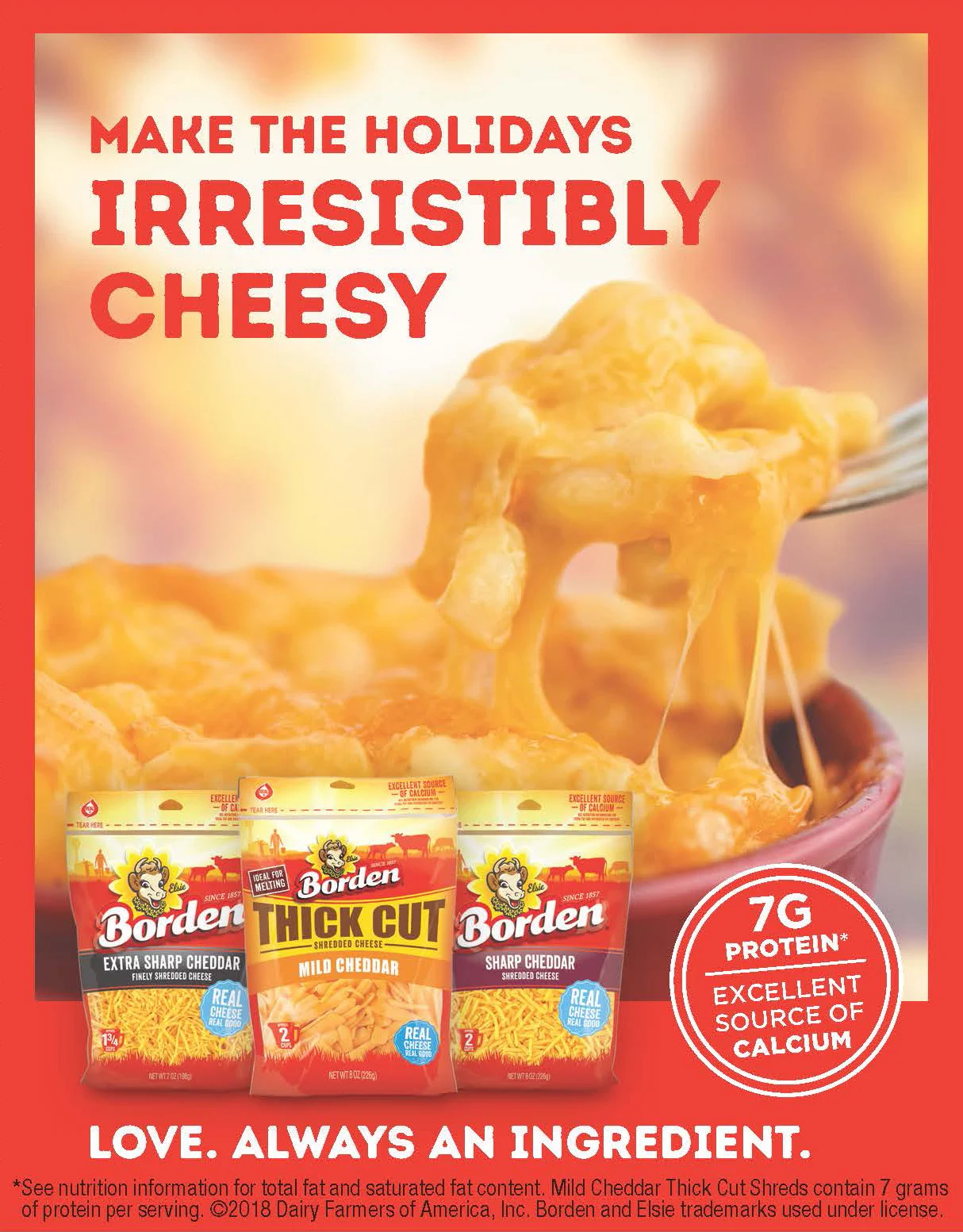
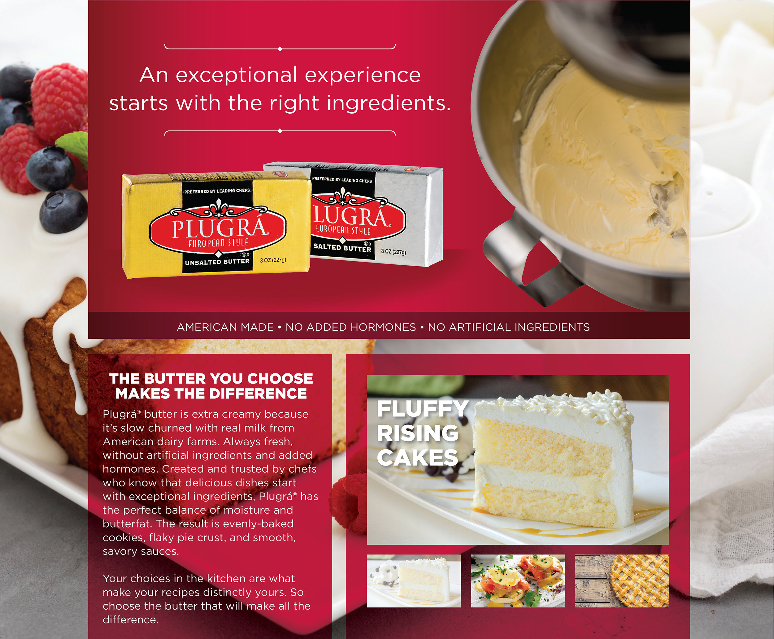
Dairy Farmers of America

7
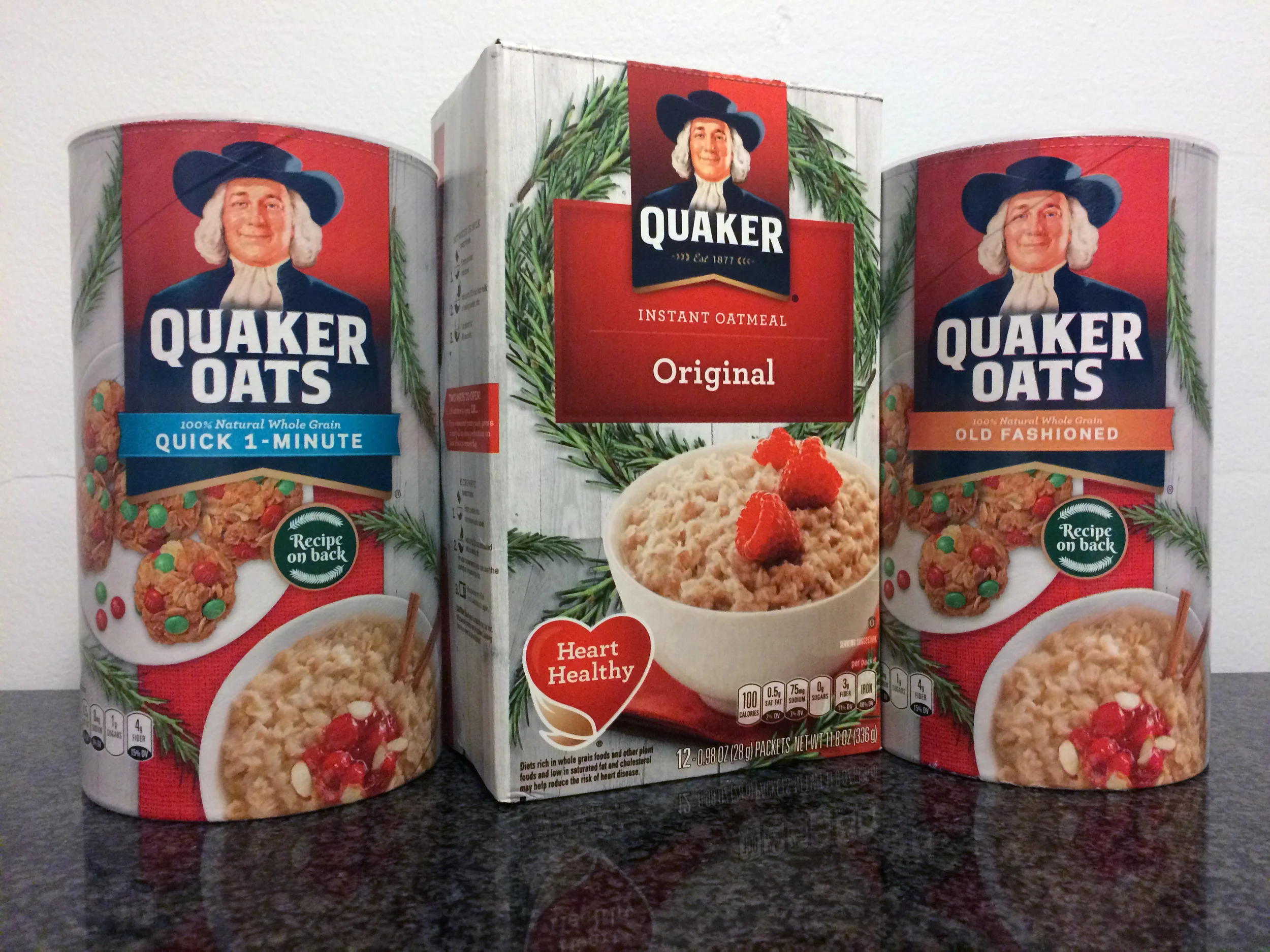
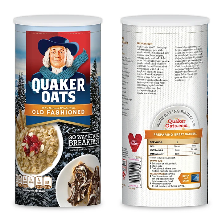
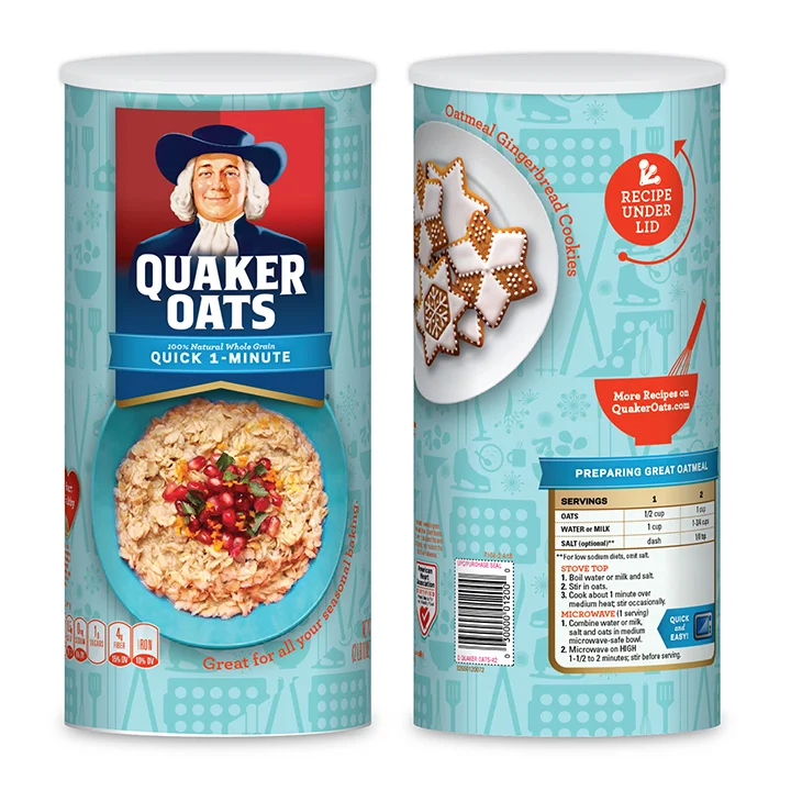
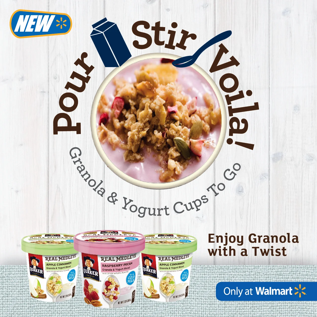
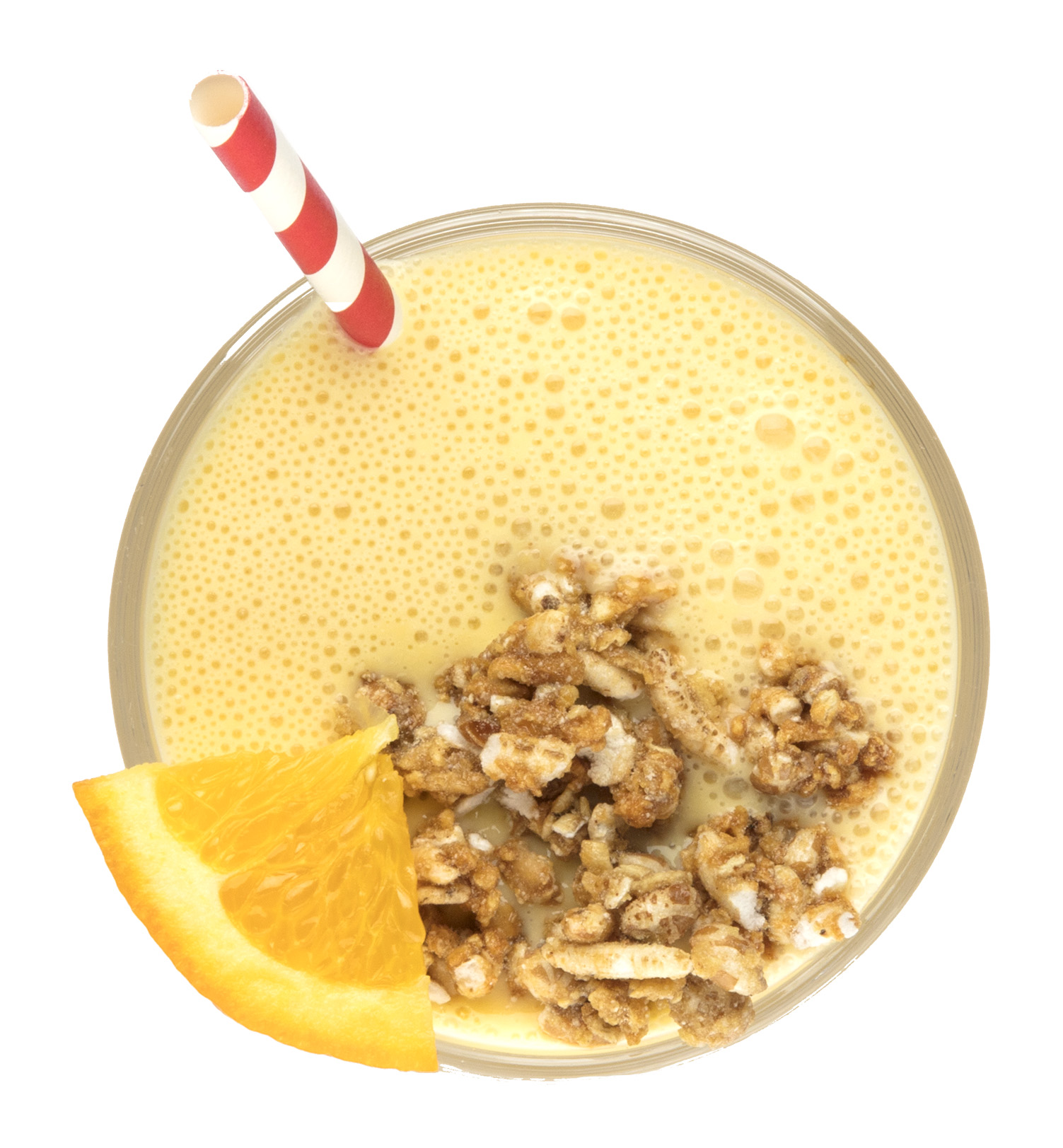
Quaker Oats Holiday Package

23
Quaker & Target Summit Meeting

8
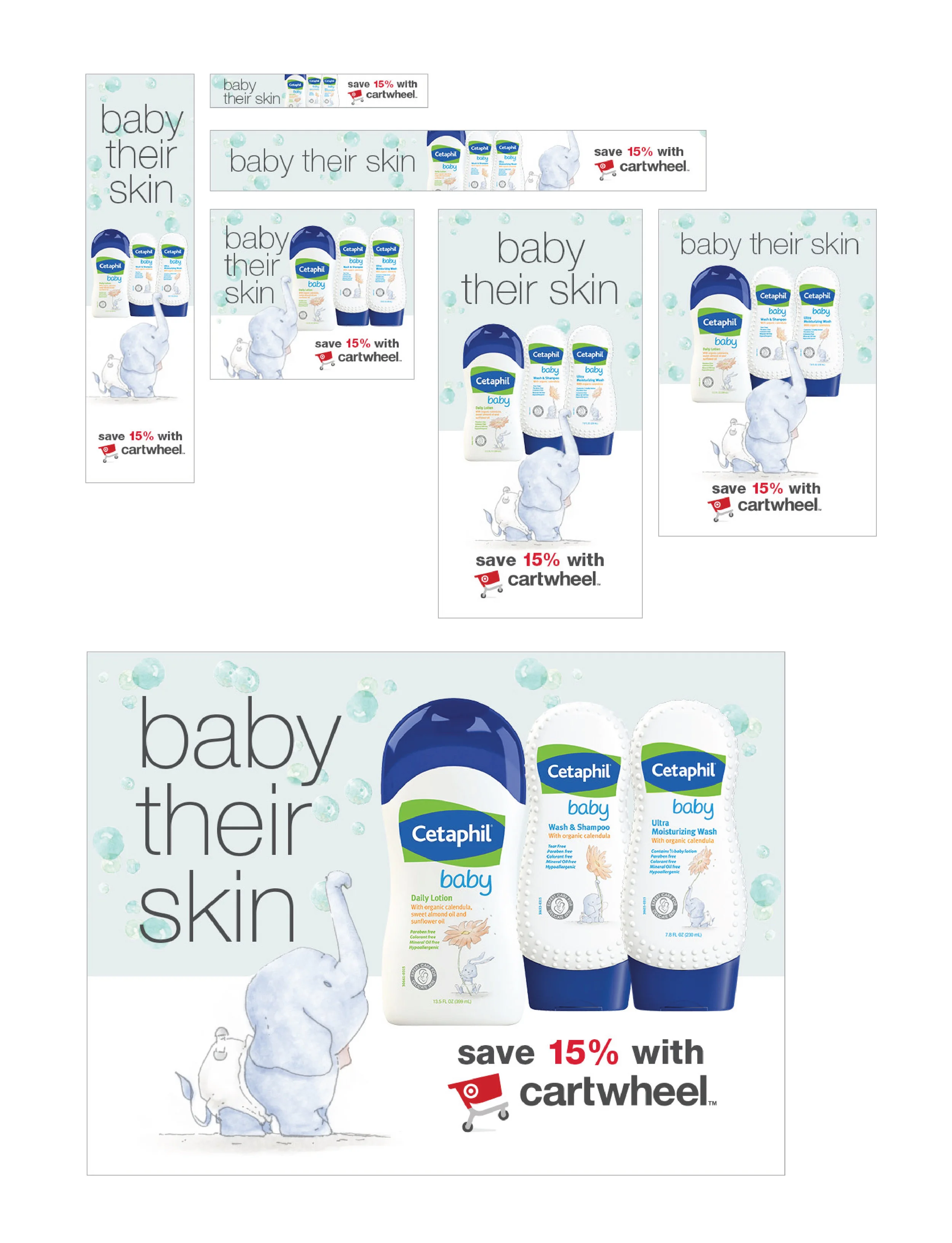
Cetaphil

12
Cap'n Crunch Quest

17
Brand Identities

23
Program Logos

61
Photography

43
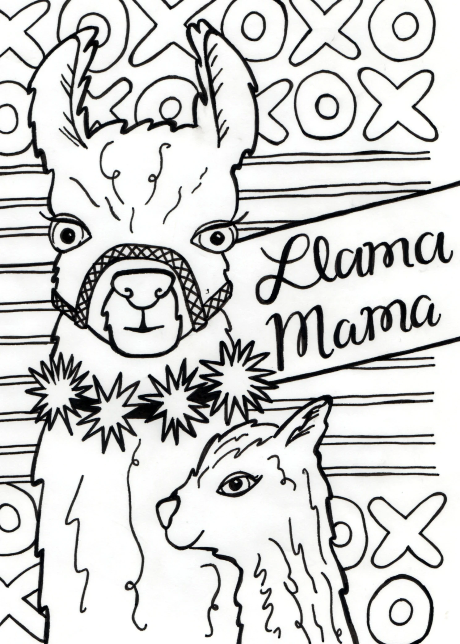
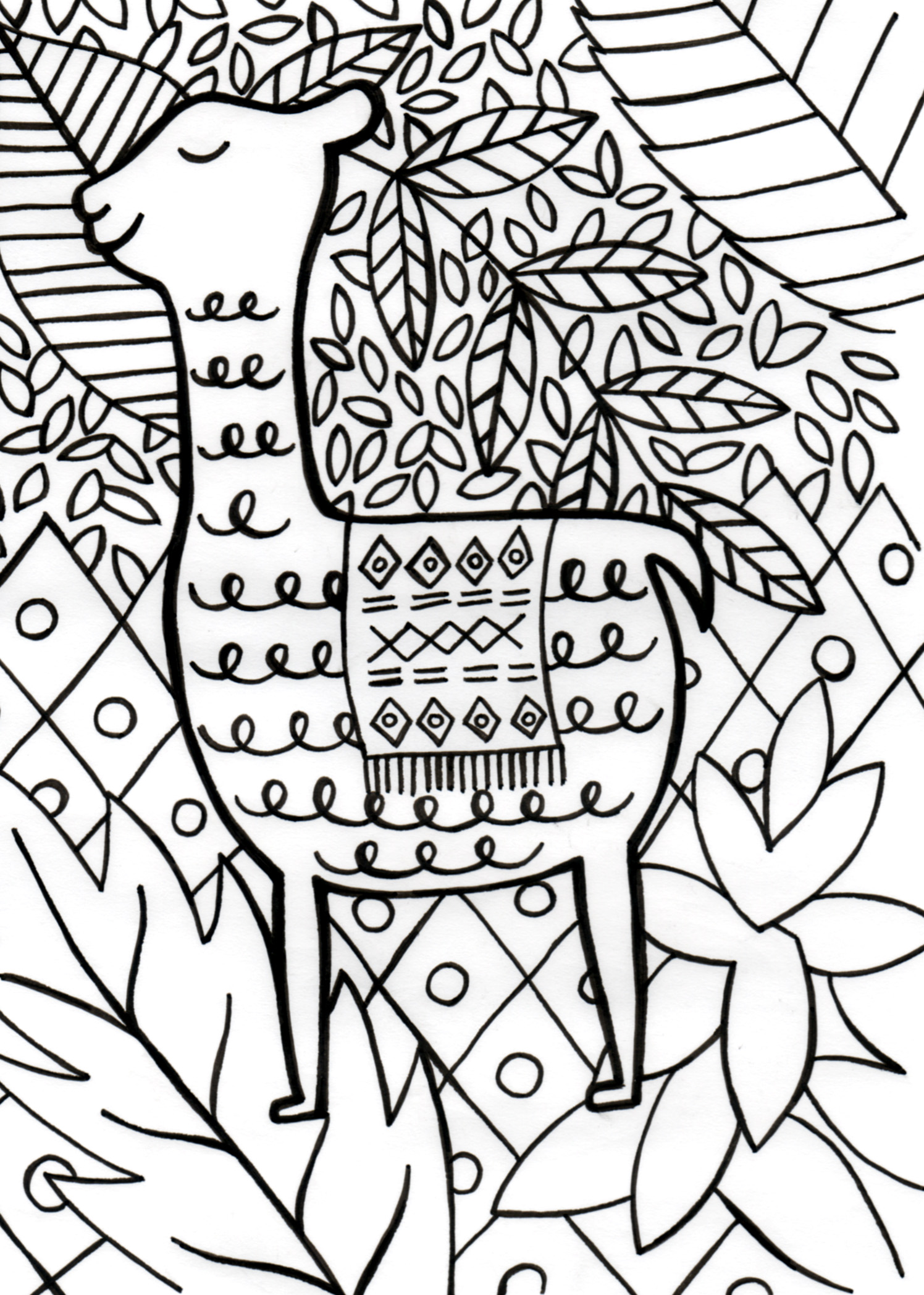
Illustration